Wednesday, June 30, 2010

Why I'm A Hobby Printer


Why am I a hobby printer? Why not make money with our letterpress shop? With the current popularity of letterpress wedding invitations, birth announcements, and other hand-crafted pieces, there’s a market for what my husband and I could produce. Despite this, we have remained primarily printing hobbyists.

The growing appeal of letterpress to the general public is certainly a trend I applaud. More people are recognizing the beauty and skill that goes into creating a handmade printed piece. And why not commemorate a wedding, anniversary, or birth with something one of a kind? I’ve seen wonderful creativity go into many of these letterpress pieces for hire done by other printers.

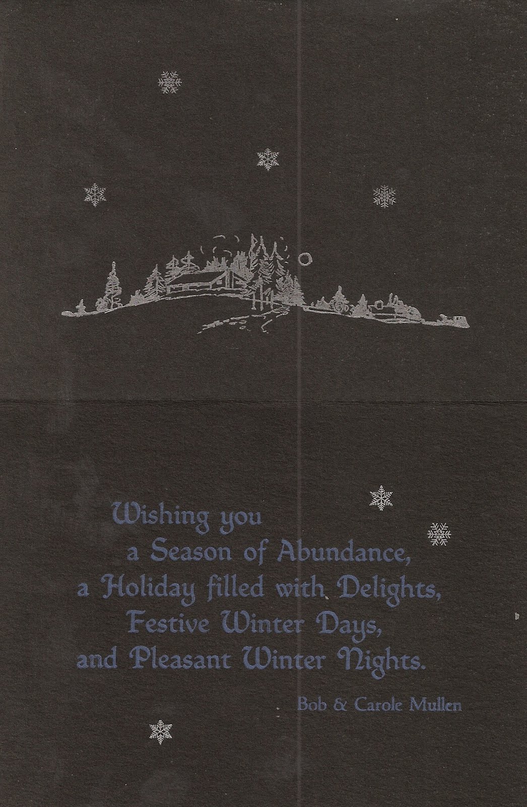
But instead of dealing with sometimes demanding customers, Bob and I have chosen to print what we want, when we want, how we want. It’s just the way we are. We’re stubbornly independent, and if we printed mainly for money it would take much of the joy out of it for us. So apart from the occasional job that interests us, we choose what we want to print − a poem, a saying, a holiday card, a booklet, a historical piece. We design and print each piece the way we want to print it. This keeps letterpress open-ended and exciting for us.

Something we’ve had fun doing over the years is using our press to print quotes that are significant to ourselves or others. For example, the custodian at the public library where I worked found a battered photocopy of a quote on attitudes inside a returned library book. He shared it with me, since it was a favorite of his. When he retired, Bob and I printed and framed the quote and gave it to him. I know it was one of the more meaningful gifts that he received.

Another friend had a favorite saying that we printed to decorate her desk at work: “Blessed are the flexible, for they shall not be bent out of shape.” We enjoyed designing the piece using old Victorian type that bent and curved, with a wiggly border to match.

We have a friend who loves to go out for breakfast, so much so that he calls himself, “The Commissioner of Breakfast”. We printed a business card for him to leave at restaurants where he’d had an especially good breakfast − and we liked the idea so much that we printed cards for ourselves, too. It’s amazing to see how happy you can make a waiter or waitress by handing them a simple hand-printed card. Interestingly, people tend to believe there’s really a Commissioner of Breakfast, even when you tell them it’s a joke − if it’s printed on a business card, it must be true, right?

One piece we printed, “Destined for Greatness...” sums up much of the feeling I have towards printing for pleasure. When I print I try to remember to take it easy, pace myself, and remember that the things I do just for the love and joy of it truly matter.


This quote on attitudes by an anonymous author was printed in Grolier with Empire border.


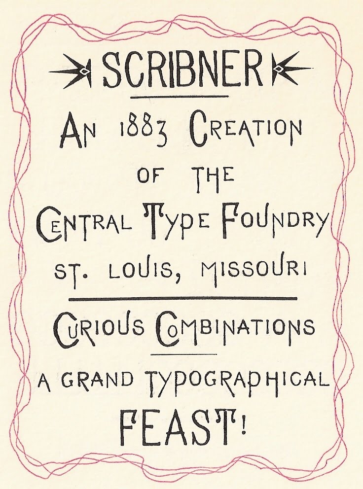
The eccentricities of Scribner by the Central Type Foundry of St Louis fit this quote.


We love handing these out whenever we have an especially good restaurant breakfast.

Wednesday, June 23, 2010

A Printer's Daughter


So how did I get interested in printing? I was lucky enough to catch the printing bug from my dad, a longtime letterpress enthusiast. In both houses where I grew up, the printing press was in the basement directly below my bedroom. Dad was an insomniac, so most Saturday mornings the press was running by 6:00am. I’d sneak downstairs in my pajamas and go, “Whatcha doing, daddy? Can I help?” And he’d let me. As a little girl I put paper slip sheets between his printed pieces as he ran them off. From there I graduated to distributing type, with a diagram of the California Job Case in front of me. Then he taught me how to set type, first ragged right and then justified.

My first printed piece was a fairy tale I wrote when I was eight, called “What You Get Depends On What You Do”. With much help, I set the straight matter in 18 point (big type for little fingers). Dad set the title page and colophon, and did the lockup. Then he hand-turned the flywheel of the 8x12 Chandler and Price while I stood on a stepstool and fed each piece of paper to the press.

Growing up with a printer father meant I had birthday napkins with my name on them; a printed license plate for my blue pedal car; and when I got older, business cards for babysitting. I remember Dad and I printing a poster with antique type and a clipper ship for my history class, and a menu for a Latin club banquet. I liked to set and distribute type, so I was a good helper, or “printer’s devil”(printing apprentice). Plus I learned about design, lockup, and impression through watching Dad print.

One bigger project we did together was an ambitious Christmas card when I was in college. I wrote and set “Green is for Christmas”, and helped with cut choice and layout. Dad’s skill in printing the many multi-color cuts in the booklet was amazing to me. He printed a lot, almost every weekend and some weeknights, so I suppose his abilities grew with practice. As I look now at his earliest printed pieces, I can see his printing evolving. By the time I was learning, printing was second nature to him.

After I got married, my husband Bob caught the printing bug. We acquired our first press, a tabletop Kelsey which was hard to get to print well. The only way to get a decent impression was to pad the platen with Kleenex. We had our share of printing bloopers, including printing a piece on erasable bond typing paper with ink that refused to dry. Dad came to the rescue, offering an ink that would work with our dubious paper choice.

I was lucky enough to grow up with printer’s ink in my blood. Now I share the hobby with a husband who is equally enthusiastic. We’re happy to carry on a family tradition of printing just for fun!

My first printed piece, "What You Get Depends on What You Do".


Latin Club Menu cover. My Latin teacher also taught my father, and was a family friend.


Latin Club menu interior. Don't ask me what all we had: the main course was KFC with side dishes, but this menu made it look elegant.


"Green Is For Christmas": this card included five pages of text and five multicolor cuts.


"Green Is For Christmas" interior: Dad's ability to print in close register is something I admire to this day.

Wednesday, June 16, 2010

The Joys of the Wayzgoose


Can you think of anything better than getting together with a roomful of people who love the same printing hobby you do? Especially when some people wonder about the sanity of us hobby printers, hauling home tons of lead, cast iron, and heavy machinery, and tinkering with slivers of metal to form sentences and paragraphs, one letter and one space at a time.

At an APA Wayzgoose (printer’s convention) you have the opportunity to swap, sell, and salivate over type, cuts, presses, and whatnot. You meet printers with years of expertise that they’re happy to share. You meet new printers full of enthusiasm and excitement. You talk, hang out, meet and greet. Old friends are there, and new friends are there to be discovered. For one glorious weekend a year you eat, sleep, dream, and live letterpress.

Between attending printer’s conventions with my family as a kid and going to them with my husband as an adult, I’ve been to 27 APA Wayzgooses. Still it never gets old, and I never miss one if I can help it.

There’s opening day, the gathering of trucks, vans, trailers, and flatbeds. You chat in the hospitality room, sharing stories about the treasure trove of type you stumbled upon or the one that got away. There may be a chance to run old presses, tour another printer’s shop, or visit a printing museum or rare book room. You socialize late into the evening, talking with old friends, squinting at proofs of unidentified typefaces, meeting new people and asking about their interests and presses.

Saturday morning and the hunt is on! Swap meet tables fill with type, cuts, borders, galleys, books, quoins, presses, and whatnot. Buyers circle the tables all morning, snatching choicest finds first, returning to see what they missed, and in the last throes of the buying frenzy deciding they want that font of 8 point Stymie with only one lower case e after all.

Following lunch it’s the auction, a master performance of salesmanship and standup comedy. The auctioneers roll through the lots, ogling some and trying to figure out what on earth others are. Lots run the gamut from rusty galleys to rare fonts of 19th century wood type. There’s a steady supply of humor throughout and the bargains abound, with a few choice items bid to the skies near the end.

The final treat of the day is the banquet, a chance to enjoy a good meal and good conversation, learn more about printing technique or history from the guest speaker, and maybe if you’re lucky win one of the door prizes. Once again printers talk late into the night.

The next morning trucks, vans, trailers, and flatbeds disperse in all directions, sagging under their loads of metal and cast iron. And with fresh knowledge and inspiration, printers look forward to the Wayzgoose next year!

Warmest thanks to Austin and Jean Jones, hosts of the 2010 Huntington, West Virginia Wayzgoose at Heritage Farm – a great time was had by all!

2010 APA Swap Meet: Ky and Sara Wrzesinski ponder a purchase from Dave and Charlene Churchman, with John Deason looking on.

Auction at the 2010 APA Heritage Wayzgoose: Auctioneers Dave Peat and Dave Churchman work the crowds.

2010 APA Heritage Wayzgoose Hosts Austin and Jean Jones. Thank You!!!

Wednesday, June 9, 2010

Wayzgoose Bound!


When I was a kid, our family vacation was often a trip to the annual printers’ convention, or Wayzgoose. And what fun it was! My sister and I learned about printing, and met wonderful people in the process.

By the 1960’s my father Gary Hantke had joined the Amalgamated Printers Association, or “APA”, a group of hobby letterpress printers from around the country. 1961 was the first convention in Chicago. I remember my dad and his printer friend Emerson Wulling boarding the Burlington Northern train to attend. My sister and I were little enough to cry when Dad left.

By the time the 1964 Munster, Indiana convention rolled around, the printers’ convention had become our summer family outing. Dad loaded down the Mercury station wagon with type for sale. When the back end sagged, he moved type onto the floor of the back seat. My sister and I rode surrounded by piles of type next to the station wagon doors and on the hump between us. This made restroom stops at gas stations a challenge, but after awhile we got pretty good at vaulting over the piles of type to get in and out of the car.

In 1964 the APA printers’ convention was called a “picnic” by many. Wayzgoose, a historic term for an outing given by the master printer for his apprentices and journeymen, was just starting to be used. The Munster Wayzgoose took place at a strip motel across the street from a farmer’s market. Rows of rooms surrounded an open grassy area where the convention took place. Printers drove their cars onto the grass and unloaded them. There was no formal agenda. People talked shop and bought and sold type and equipment from the back of their cars. Ward Schori ran a type setting contest, and John Boulette dressed up as a clown to entertain the kids. Meetings were held outside, with mosquitoes in heavy attendance. The hosts provided Sunday picnic lunch for everyone. I still remember Elsie Boyd’s delicious potato salad.

For us kids there were other things to do. My sister and I went to the farmer’s market with printer Lillian Worley and bought a watermelon. We cut it open and sat on the curb eating it, laughing as Lillian taught us how to spit watermelon seeds. We had fun visiting Blanche Duerr, wife of printer Emerson Duerr, too. Blanche was a grandmother in her seventies then, but lively and full of fun. My mother, sister and I all learned to dance the Charleston in a motel room in Munster, following Blanche’s enthusiastic lead.

For over a decade, my family loaded up the car and went to the “Goose”. Once the swap meet started, my mother, sister, and I combed the tables. Often we’d see a great cut to show Dad. Mom would get terrific deals − people gave her ink, type, and cuts. She knew good stuff and could spot it quickly. We kids had our share of “finds”, too.

Today I still remember riding in our overloaded station wagon, looking forward to all the fun we were going to have at the Wayzgoose. Today my husband Bob and I look forward to the same thing. What a great weekend, talking printing, meeting people, seeing old friends, swapping type and cuts. This time of year it’s wonderful to be Wayzgoose bound!


Program from the first 1961 APA Wayzgoose in Chicago. The illustration was printed letterpress, using rule and bits of border.


Activities at the Chicago Wayzgoose in 1961.


Banner for a car antenna, from the 1964 Munster Wayzgoose.


Luke Cory kidding with John Boulette (Jo Bo the Clown) at the 1964 Munster Wayzgoose.

Wednesday, June 2, 2010

My Favorite Typeface(s)

Naming a favorite typeface is like saying which of your children you like the best. I like too many typefaces to choose one favorite. In fact I like too many typefaces for my own good, but that’s beside the point. Picking one favorite is limiting. From the type we have, I can pick one favorite body type, one italic, one display type, one text, one uncial, one antique type − maybe.

After all, different typefaces are good for printing different things. If you’re doing an art deco piece, you need art deco type. If you’re quoting Dickens, something like Caslon would be appropriate. Doing a Christmas card or something religious ─ use text. Something medieval − maybe an uncial. Something Victorian − a medley of wildly eccentric typefaces from the 19th century. Typefaces have all kinds of flavors, and like gourmet jelly beans, different combinations create an entirely new experience.

But back to favorites: for body type (type used for the bulk of material in a piece) I would pick Italian Old Style. I enjoy setting and reading it, probably because of its openness and clarity. And we have a nice assortment of sizes in roman, italic, and small caps. But I like Caslon, Garamond, Devinne, and LaClede Old Style, too. How can I choose just one!

A quote in Italian Oldstyle, with Hadriano Stonecut for the title.


My favorite italic type would be a tie between Caslon Italic 471 (with long descenders) and Grolier, a beautiful old MacKellar face with kerned characters. Are two favorites okay?

A Christmas card using Caslon Italic 471 for a quote from Dickens.


A Valentine showing the flourishes of Grolier, an elegant kerned font from MacKellar, Smiths, and Jordan.


For display type, a favorite is Legend, with its Arabian Nights look. Then there’s Parsons, with its wonderful ascenders and descenders, full of design possibilities. So many great display types are out there − Hadriano Stonecut, Schoeffer Condensed, Parisian − each perfect for a certain kind of printed piece.

Legend type, used for the title page of "A Tale of Arabia".

Parsons by Will Ransom has many optional ascenders and descenders, but the trick is figuring out where to use them.


Text type is easier to decide on. Washington Text has the less conventional text look I prefer. For text-like appearance that’s not quite text, I like the pen-lettering look of Freehand.

Washington Text, a text type from the Keystone Type Foundry.


A Christmas card using Freehand, a versatile pen-lettering typeface.


With uncials, that ancient medieval letterform, my favorite is Worrell Uncial. Though we only have it in 12 point, we use it often.

A prop card using Worrell Uncial to print "A Private Press Dedicated to Printing for Pleasure, Self-Expression, and the Preservation of Letterpress Printing History".


Choose one favorite antique type − impossible! They’re as individual and eccentric as a ninety year old maiden aunt. But if I had to choose, candidates for me would include Scribner, Art Gothic, and Atlanta.

Scribner, an eccentric typeface from the Central Type Foundry of St. Louis, is fun to play with.


Some types I lust for include Goudy Mediaeval, Civilite, and anything unusual or antique. Type lust, I must confess, is a disease. You know you’ve got it when you find yourself drooling over fonts and specimen books.

Is there any type I don’t like? Yes. Brush. It’s thick, clunky, and often badly used. Brush sets my teeth on edge. Thankfully we no longer own any.

So ... what’s your favorite typeface?